Ever since the computer was invented, business software seems to have overlooked the fact that it’s us humans that have to use it.
Have you ever been frustrated by a hard to use TV remote? By comparison, much business software is impossible to use without extensive training and it’s hard not because it’s complex, but because of poor design. Here’s why UI is important yet often overlooked.
Outside of machine-to-machine communication, it’s us humans that are the users of technology, yet it is shocking to see how little effort is given to human-computer interaction, especially in the world of industrial and business software.
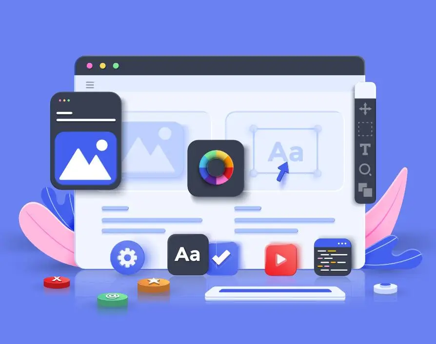
UI (user interface), or UX (user experience) design, is a well understood and developed profession, with specialist roles, numerous guides, courses and qualifications available. A look at almost any mobile phone will showcase what’s achievable – highly complex, feature rich devices, that can be used by almost anyone without so much as an instruction manual in sight. Through painstaking research, testing of screen layouts, wording and the use of recurring principles, UI designers manage to make even new apps and features feel natural and easy to navigate.
For example; When we read a sentence, we put more focus on the end of the sentence than the beginning, since the end is the last thing we read. So when you are told during a payment “Do not remove your card” the bit you see most is “remove your card”. You’re likely to have seen this and taken your card out early at some point. Changing the text to “please wait” instead, results in greater compliance. Good UI uses this effect to write easier to follow instructions such as “To create your account, enter your email” rather than “Enter your email address to start your account.” (This can be used effectively in marketing too, by ensuring the call to action appears last).
The use of clear symbols, either those in common use already, or those which simply and accurately reflect the action are another key consideration. People prefer images and icons to heavy areas of text. There are some terrible icons in this world, most cheaper TV remotes are frustratingly hard to use due to poor iconography combined with an almost random button layout.
Compared to poor product design, business software generally far worse when it comes to human interaction though. I’ve seen multiple platforms where the “save” and “cancel” buttons swap sides and move around the screen from page to page. No one thinks that’s a good idea.
Great design isn’t hard, but you need to stop writing code for a bit and start thinking about the actual user. Too many platforms are built by engineers for engineers, despite being used by non-technical staff. In the world of order fulfilment (an area I have some expertise in) where businesses expect people to interact with software 1000’s of times a day, performing largely repetitive picking and packing operations, it is incomprehensible how little effort goes into UI design. Often pickers are given a product code, e.g. ZYX-1253 and told to locate it from location A1-23. From a software engineers perspective this is exactly what is required, but it’s not how the average human brain works (most software engineers do not share the average person’s thought process).
Instead you should be showing the picker a picture of what they are looking for, with a description in plain english, and graphically showing that this item can be found on the bottom right hand shelf. That’s how you’d tell someone else to do, so why would you build a platform that did it differently?
Share via: