The thing is though, it goes so much deeper than that. Brand colours aren’t just about recognition, there’s a deeper psychological effect that the colours of a brand have on us. In fact, we make up our mind on a brand in seven seconds purely based on their colour choice.
That’s all you get. Seven seconds before your target customers make up their mind on whether they like you or not. And it’s all subconscious, we’re not even aware that we’re making these judgements. It’s because each colour has a meaning attached to it, a deeper meaning that gives us an emotional reaction. Stop signs are red because in that context it represents danger. On the other side of that coin, Cupid’s arrows are red because red is also the colour of love. We attach so much meaning to colour, and brands can take advantage of this.
Choosing the best colours for your business
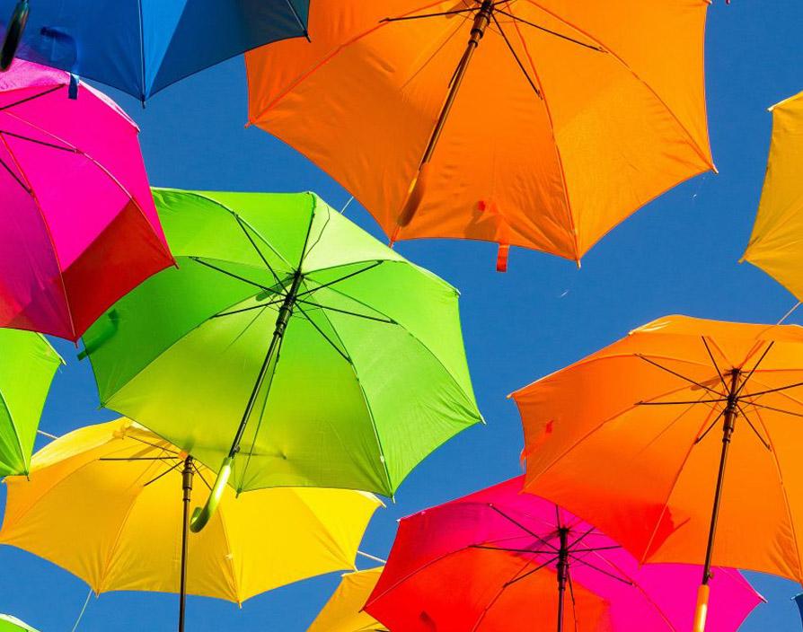
Here’s a breakdown of the main colours and what they mean in your branding:
Red: Power, Strength, Determination, Passion, Love. Used by a lot of food and drinks companies to stimulate people’s appetites.
Yellow: Joy, Happiness, Intellect, Energy. Used to invoke a feeling of cheerfulness.
Green: Growth, Harmony, Freshness, Hope. When BP did their $211 million brand re-design, they chose a predominantly green logo to curb some of their environmental faux pas.
Blue: Stability, Trust, Loyalty, Wisdom. Blue is a favourite of investment banks to create a feeling of security and stability.
Purple: Power, Nobility, Luxury, Dignity. Cadbury’s signature purple wrappers are there to attach a luxury feeling to their chocolate.
Orange: Fascination, Creativity, Determination, Stimulation. Used for brands that want to put creation and fun at the forefront.
Grey: Balance, Formality, Conservativeness, Sophistication. Apple uses a simplistic grey logo to mirror their high tech product line.
Black: Elegance, Formality, Mystery. Used by brands like Chanel and Prada to reinforce their high brand value.
White: Goodness, Innocence, Purity, Cleanliness. Often paired with black to create a simplistic, refined feeling.
Pick colours that accurately reflect your brand and fit within your market. In terms of how many colours you should have in your brand logo, avoid having any more than three: A primary, a secondary and a tertiary. It’s most common to have white and black as two of the colours, and then one other, dominant colour.
Share via: