On the surface, shopping may seem like a rather humdrum, everyday activity, but that view really does belittle the thousands of split-second choices we make as we browse the shelves. JKR Global is one of the UK’s premier packaging design agencies, working with prominent brands such as Guinness, Hovis and Charles Worthington. “In a very crowded store, people get snow-blinded by the volume of things they’re looking at,” explains JKR’s chairman and co-founder Andy Knowles. “What you’re trying to do is help them shop without having to think and work too hard at decoding all of the thousands of things that are on the shop shelves.”
Not too much to ask, then. But there are ways in which a careful consideration of your nearest neighbours can prove invaluable. “The first thing I’d say is that the context is critical,” says Knowles. Nothing effective can be designed in a vacuum; when designing product packaging, an enterprise needs to be able to defend against all of its competitors’ strengths and to learn from its weaknesses. However, even this might not be sufficient – to impart something of real value, packaging needs to be able to communicate something of the idea or ethos behind it. “In our view, what packaging design does best is it makes it distinctive in a way that’s relevant to the brand, the brand ethos and what it is attempting to achieve,” he continues. “We try to do something that is distinctive and true.”
Studio h is also no stranger to this idea. Nicky and Rob Hall – business and creative partner respectively – have a long experience of teasing out the inherent aesthetic value of a brand. “Some things consumers just buy into,” Rob says. He points to Apple as an example and how its brand value has come from following through its ethos in its design. “Anyone you rate out there, it will all be down to how brave they are, how strong that vision was,” he explains. Studio h’s knowledge of the market helps develop the brand based upon the aesthetic values of the enterprise. “We’ll look at what’s in the marketplace, who’s doing it well, and how we can achieve those results, but after you come up with your ideas it really comes down to the strength and the vision of the client.”

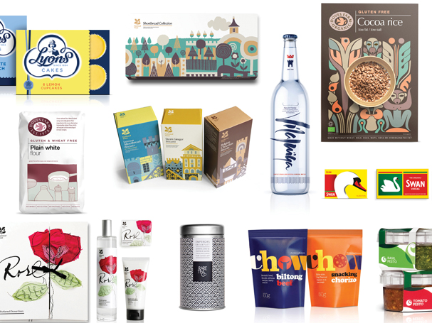
Ensuring each product dwells in its own unique space is always going to heavily depend on the ideas the brand represents. “Hopefully, the client has focused on their product – they know it and they love it,” explains Nicky. An excellent example is the Rare Tea Company. “Tea is not a new product to most people, but Rare Tea – the idea of special tea – is possibly a new one.” Prior to commissioning Studio h, the Rare Tea Company only sold its tea in Selfridges in unbranded bags. But it had a clear vision of its market and the direction it would like to move in. “The company wanted to expand and particularly to get into Waitrose, because it was a very suitable market,” she says. This combination of a clear brand identity and a precise vision of its future gave the agency some clear cues to follow, resulting a very striking design.
“Part of the ability and talent of a designer is to spot the potential in the seemingly mundane,” comments Knowles. Being able to identify where hidden strengths lay is important enough when working with a new product, but when working with a well-established brand it becomes essential. “Obviously, you have to pay respect to the legacy,” he says. “You wouldn’t suddenly take Guinness into an orange can, for instance.”

He refers to their work rebranding Hovis. “It’s what I call a retro-progressive brand; it manages to blend the old with the new.” And this was the real strength of the direction in which JKR took the household bread brand. Drawing on all manner of traditional elements, the agency hinted at the history of the brand, employing elements such as traditional typography for the smaller ‘o’, as well as the yellow of its original wax-paper packaging and a symbol of a little brown loaf. However, it also utilised a modern aesthetic in these motifs, creating something fresh and original. “Often with an established brand, such as Hovis or Guinness, that’s what you’re doing,” Knowles comments. “It allows people to recognise the brand from afar, which is always very helpful in a crowded store, yet somehow it feels very fresh and interesting.”
On occasion, it can in fact be easier to have cues like this to work with. “When it’s a completely blank canvas, it can be tougher,” says Rob. With so much choice, the boundaries provided by existing brand choices can actually give a stable base to work from. “The hardest thing is to rein the whole thing in.”

Sometimes though, with a clear enough idea behind it, a new brand can enter the market with a very distinct identity. Vardo is one of Studio h’s most striking designs. “The client wanted it to make clear that it was made in Georgia, rather than coming from some global faceless big detergent brand,” Nicky explains. The team played off this national identity. As ‘vardo’ in Georgian means rose – the country’s national flower – this was a key feature of the design, while maintaining a vibrant colour palette. “It was bold and bright and completely shouting on the shelf, so it stood out among all the other brands,” she says. “Also, it had simplicity – lots of the brands are shouting and have lots of colours and swirls.”
Ultimately, good packaging design will always be about making the most of the resources that your brand identity provides. As Knowles concludes: “You’re always looking for the opportunity. You’re always looking for the thing that allows you to transcend the generic and do something distinctive and eye-catching.”
Outside the box
It’s rare that design stops at waxed card or an aluminium can, and often your brand is going to be informing all levels of your business, from your website to your own branded premises. “I think designers, even if they’re just working on a mark, are always bearing in mind that this mark might have to go across all sorts of things from websites to menus,” remarks Nicky. Particularly if a brand is going to grow with an enterprise and meet new needs as they arise, it’s important to know how to make it more than just an empty wrapper.
“In a sense, it isn’t that different,” Rob explains. “But instead of four sides, you’re looking at different dimensions or a different environment.” With existing brands there are often threads that can be carried through to other aspects of the design – even if they’re as simple as a colour scheme or the implications of a name. And this is something that spreads from a letterhead to a fully branded retail outlet. “It is tricky but within an environment space retail designers or interior designers will pick up how can they parallel the visual communication that’s there,” he continues. “The process is still the same.”
An excellent example is the Belgravia-born enterprise Tomtom Coffee House. Studio h was commissioned to provide a cohesive style throughout the outlet, providing branding on everything from the beans to the web banner. Every part of the design carries through the features suggested by the brand mark, informing the consumer of everything they need to know about the chic café.
“That’s the artistry of the thing,” Rob explains. “Most clients would think it’s a science. It’s not a science; the science is in the application of the whole thing.”